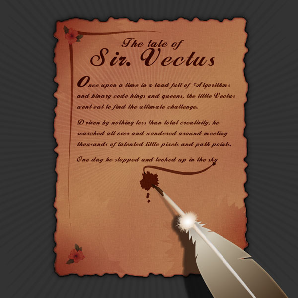
Final Image Preview
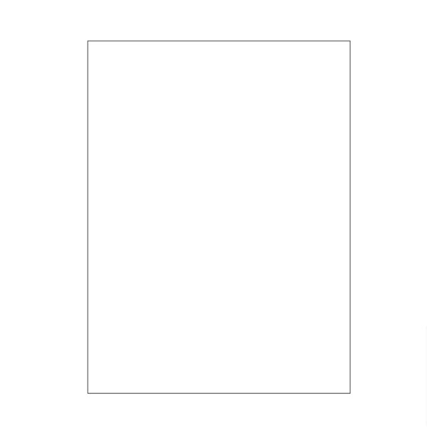
Step 1
Open up a new document and draw a rectangle with the Rectangle Tool (M). Leave the default settings of a white fill and a black stroke.
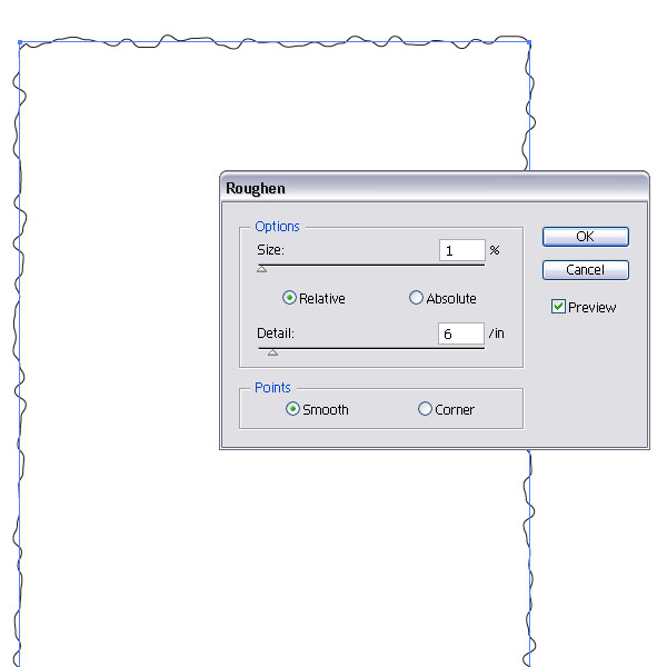
Step 2
Go to Effect > Distort & Envelope > Roughen and choose the settings you see below. This will be the frame work for our old paper.
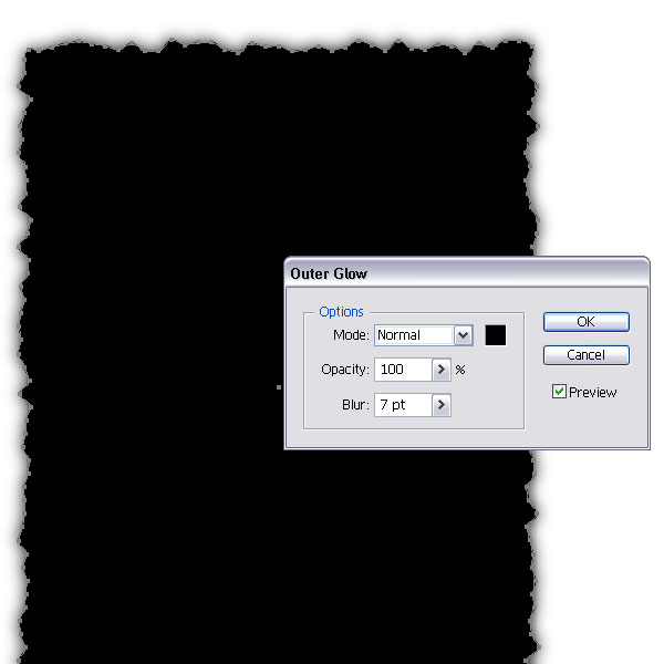
Step 3
Fill the shapes with black, set the stroke to none and apply an Outer Glow of 100% Opacity and a Blur of 7pt. Set the Mode to Normal (Effect > Stylize > Outer Glow).
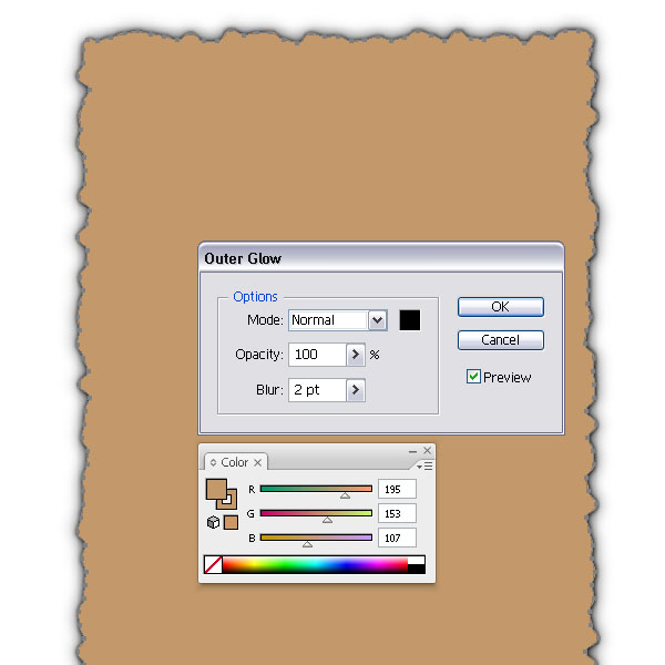
Step 4
Create a duplicate of the black shape on top (Command + C + F). Choose a light brown or beige color and fill the shape and set the stroke to 1pt with the same color. Then change the Outer Glow settings via the Appearance Palette and set the Blur to 2pt.
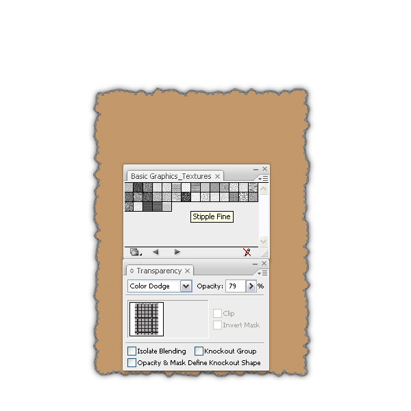
Step 5
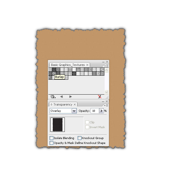
Duplicate the shape again on top (Command + C + F) and remove the Outer Glow settings. Then go to Window > Swatch Libraries > Patterns > Basic Graphics > Basic Graphic_Textures. Choose Stipple Fine and fill the shape. This will replace the beige color. Set the Layer Mode to Color Dodge, Opacity 79%. Then duplicate the shape again and change the Layer Mode to Overlay and set the Opacity to 10%. Replace the fill with Burlap from the texture palette. This will give the paper a slight gritty look.
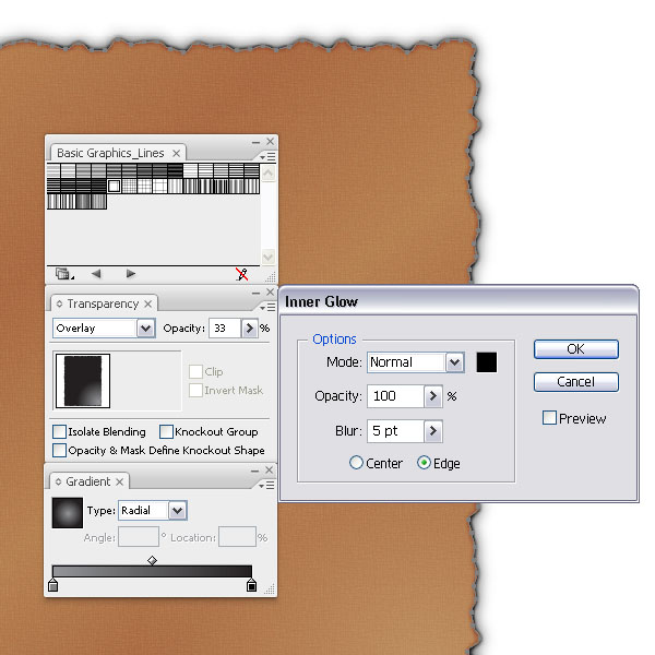
Step 6
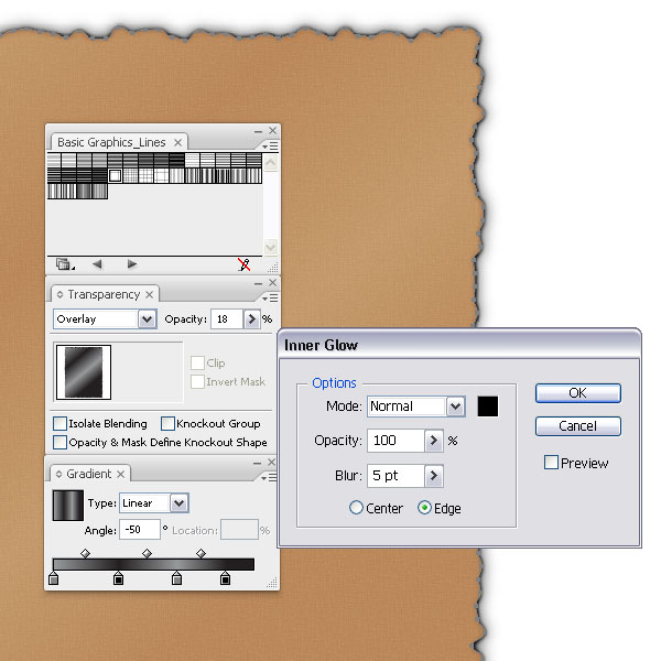
Next, make again a duplicate on top and fill it with a linear gray, black, gray, to black gradient. Set the Angle to -50. Then change the Layer Mode to Overlay, 18% Opacity and add an outer Glow, 100% Opacity, normal mode and a Blur of 5pt. Duplicate the shape again on top, fill it with a radial gray to black gradient with the highlight towards the bottom right and set the Layer Mode to Overlay, 33%. Leave the Outer Glow Effect like it is.
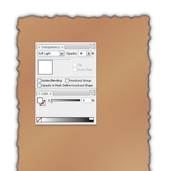
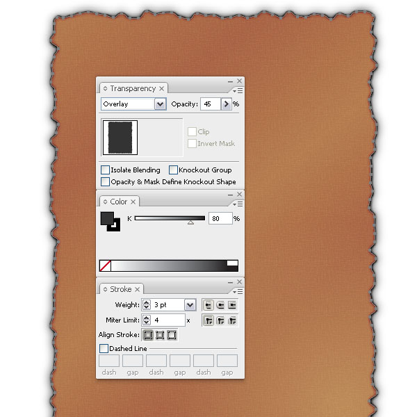
Step 7
Duplicate the shape again, remove the Outer Glow and fill it with white. Then set the Layer Mode to Soft Light , Opacity 45%. Make another duplicate, fill it with 80% black and set the stroke to 3pt, 100% black. Set the Layer Mode to Overlay, 45% Opacity. This will bring out a burned effect.
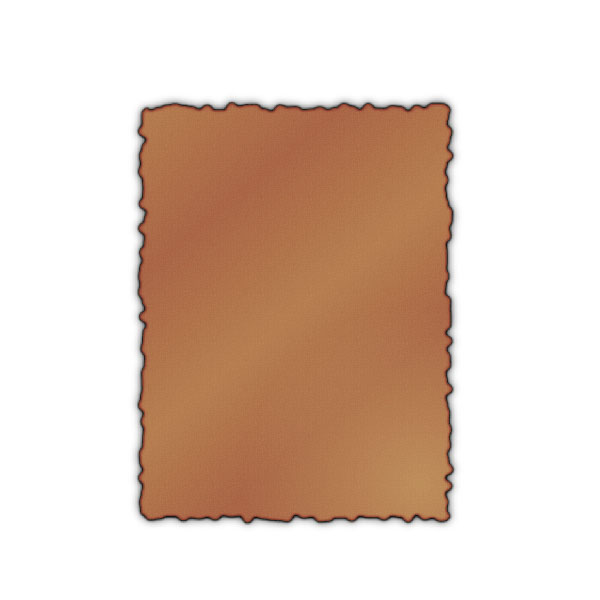
Step 8
Voila, the old paper look. We are almost there, we just need to add some fine touches.
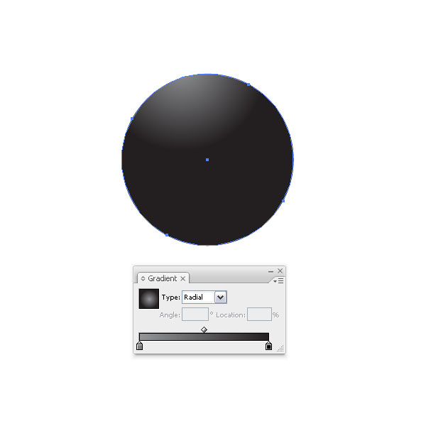
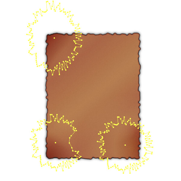
Step 9
We will create a burned corner look for our paper. Create a circle (L) and fill it with a gray to black radial gradient. Set the gradient highlight towards the top left.
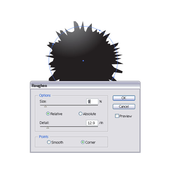
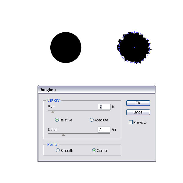
Step 10
Go to Effect > Distort & Envelop > Roughen and apply the settings you see below.
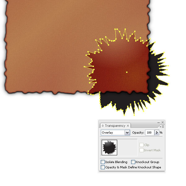
Step 11
Place the shape on top of the paper layer and set the Layer Mode to Overlay at 100%.
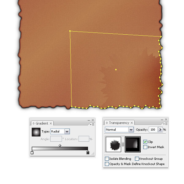
Step 12
Now since the shape is still too harsh and shows up on the background, we need to apply an Opacity Mask. We have to do one important step first. Since we want the shape to be
burned into the paper right to the edge, we will copy the original paper shape. Just press Command + C. Then apply an Opacity Mask via the Transparency Palette. Once you have activated the mask, paste the shape onto the artboard by pressing Command + V. Cut away a good portion of it and just keep a corner piece that will fit. Then apply a black to white radial gradient. Voila, this way we can hide the
burned shape and blend it better into the paper.
Step 13
Repeat Step 12 for the other corners. I only added two more.
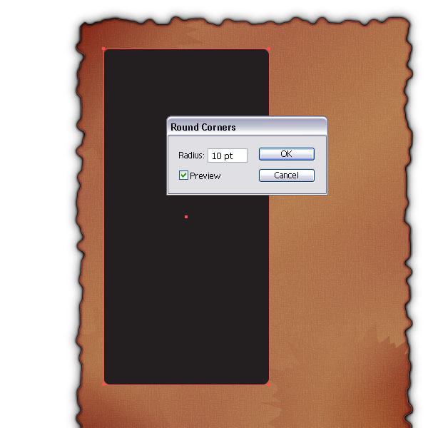
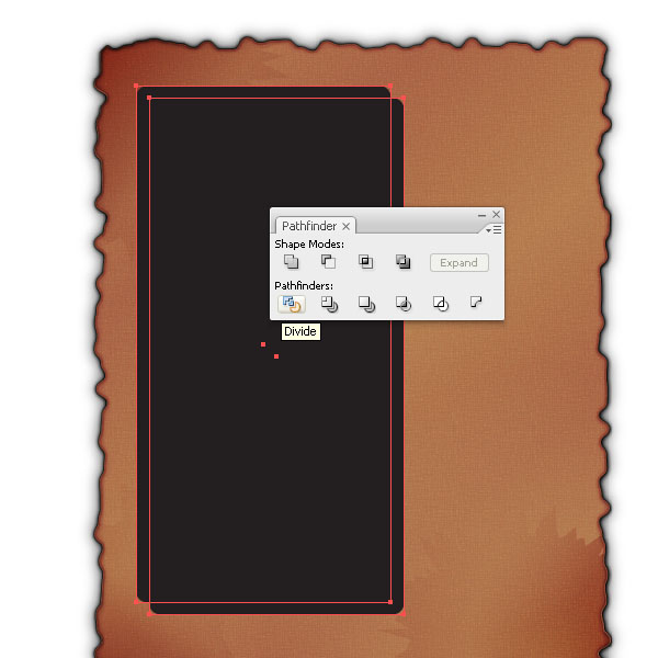
Step 14
Let's move on to the paper treatments. Create a rectangle and apply a Round Corner effect to it. Then duplicate the rectangle and offset it. Select both and apply the Divide option in the Pathfinder Palette.
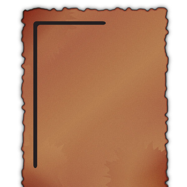
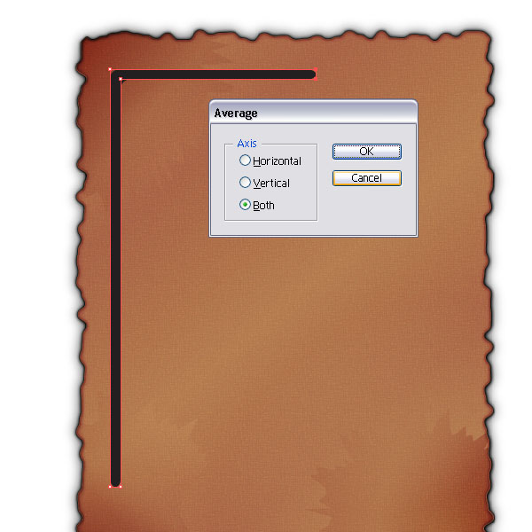
Step 15
Delete the shapes with the Direct Selection Tool (A) until you have a shape like you see in the image below. Then select both end path points on the right and Average them both on the Axis. Repeat the same with the bottom two.
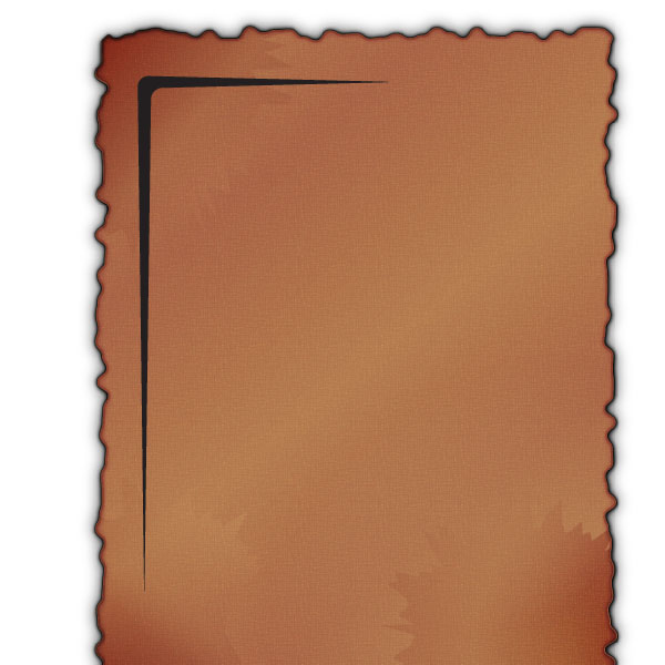
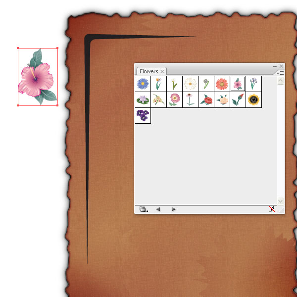
Step 16
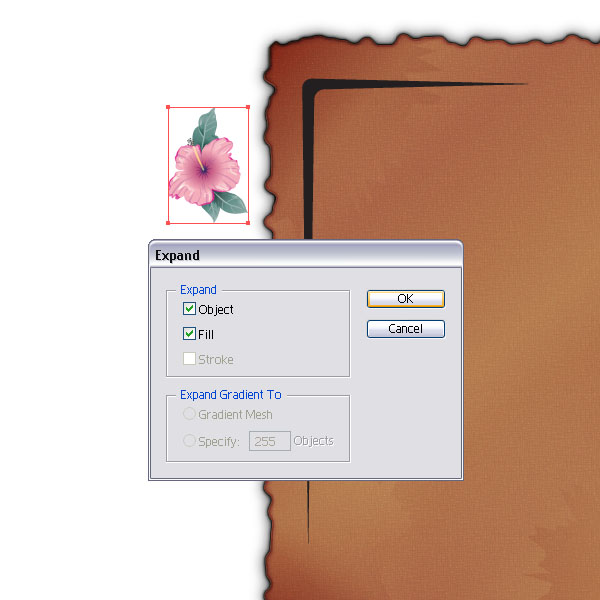
Next, open up the Flowers Palette (Symbol Library) and drag an instance of a flower of your choice onto the artboard. Select it and expand its appearance.
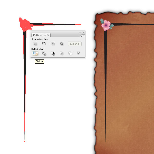
Step 17
Make a copy of the line shape and the flower and select both and apply the Divide option from the Pathfinder Palette.
Step 18
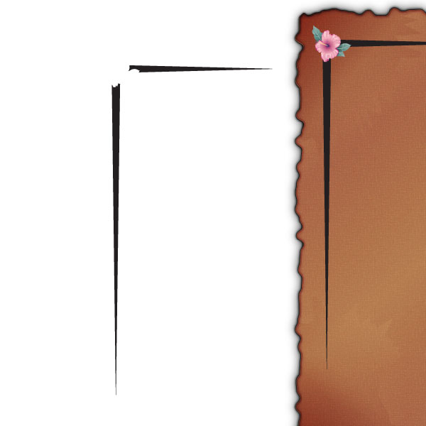
Delete all the flower parts. Left is the cut away line shape. This might look like an unimportant step, but it will help a lot (see next step).
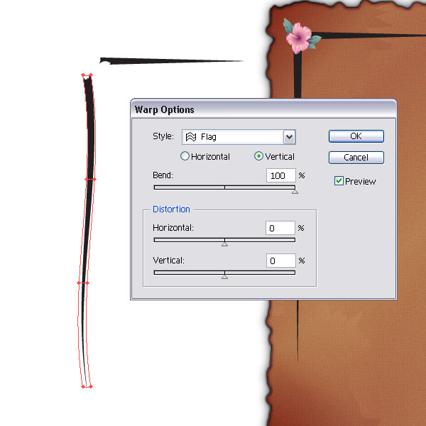
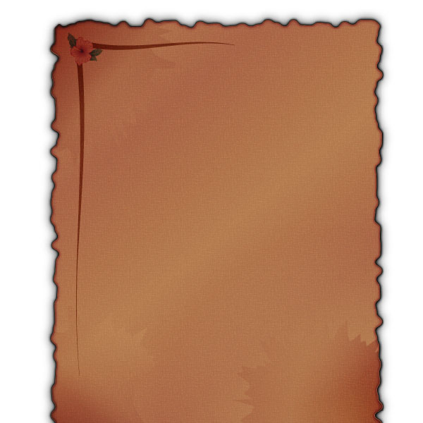
Step 19
Select the vertical shape and apply the Envelop Distort option Flag to it. Choose Vertical at 100%. Repeat the same with the horizontal one and choose Horizontal. Then select the curved lines and the flower and set the Layer Mode to Overlay.
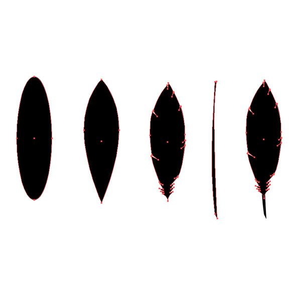
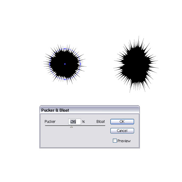
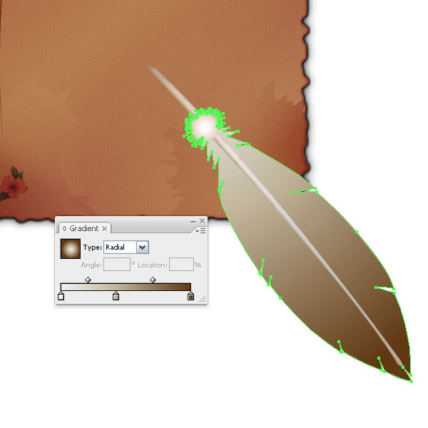
Step 20
Let's move on to the feather. I outlined the shapes we need below. You can go more into detail if you'd like. Create an ellipse (L), remove the curves and add extra path points to make it look like a simple feather. For the plume part, create a circle, apply the Roughen effect and scale it if you see fit. Then apply a Pucker effect. Expand the shape. Then make a copy and add it to the feather shape via the Pathfinder Palette. I chose some beige, white, and gray gradient for coloring.
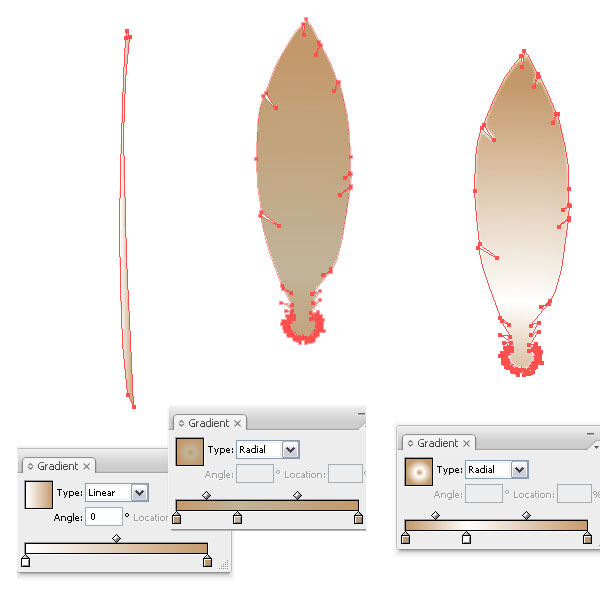
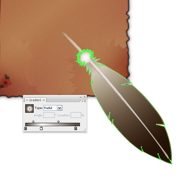
Step 21
Move the feather shape and the shaft plus the plume part and arrange them over the paper layer. I made the gradient slightly darker as well.
Step 22
Duplicate the feather shape on top and fill it with another darker gradient. Move it slightly to the bottom left. Don't forget to place the extra copy of the plume part on top and fill it with a light radial gradient.
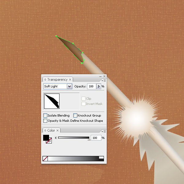
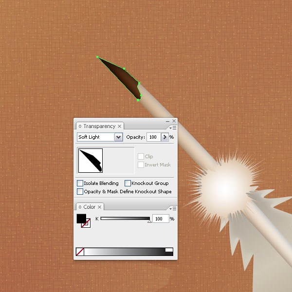
Step 23
Trace along the tip of the shaft and fill it with black. Set the Layer Mode to Soft Light. Then duplicate the shape on top. This will make it look darker. You could also try Overlay as a setting.
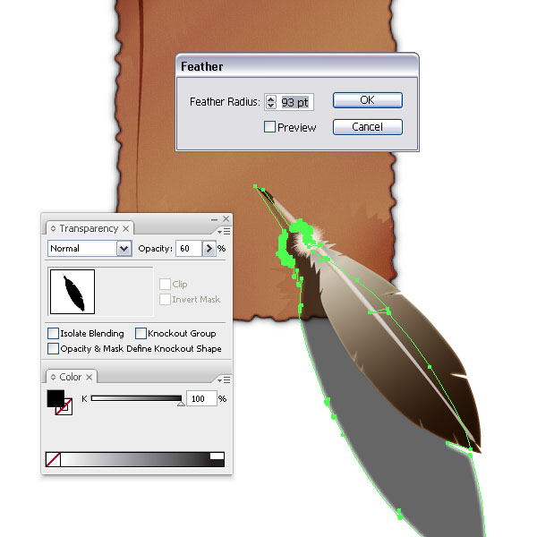
Step 24
To create a sense of depth, duplicate the feather shape with its shaft and choose Add to Shape Area in the Pathfinder Palette. Place the shape underneath the feather and distort it slightly. Set the Layer Mode to Normal and the Opacity to 60%. Then apply a Feather effect of 93pt.
Step 25
Now you are ready to add some text. Outline the text and set the Layer Mode to Soft Light or Overlay depending on how you would like it to look. Remember that a black color in Soft Light or Overlay mode will kind of
burn itself into the shapes below.
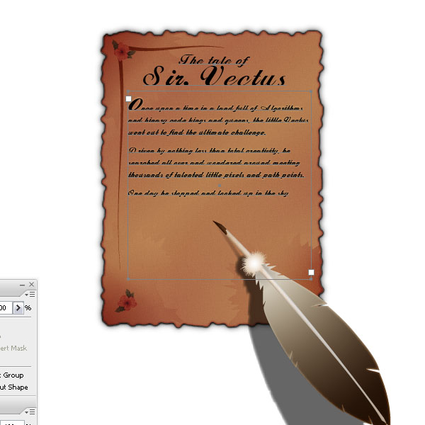
Conclusion
I added a starburst and some ink drops. Last but not least, place a darker background and you're good to go. Happy creating!
0 comments:
Post a Comment