To See My Portfolio CLICK HERE

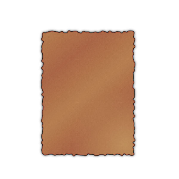
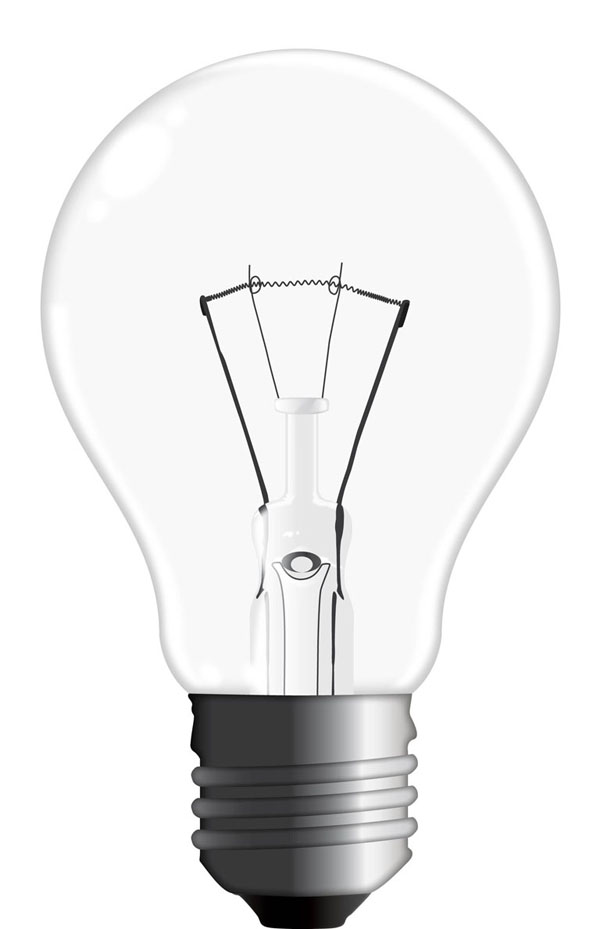
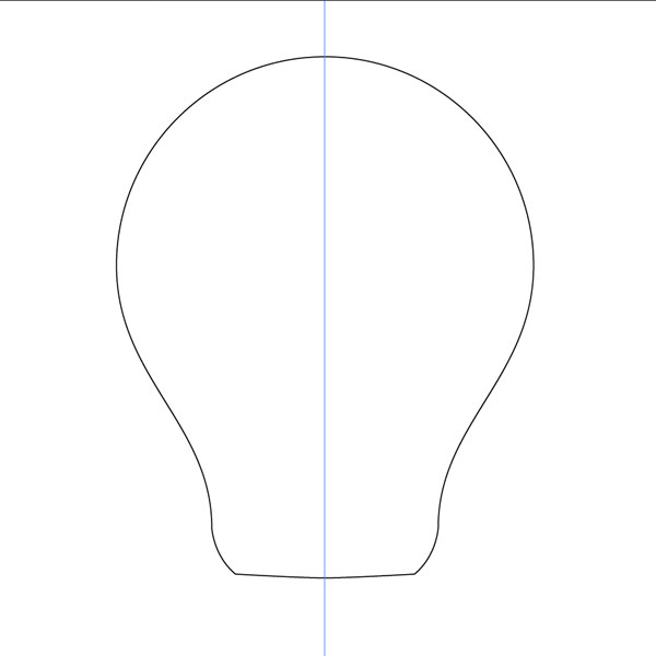
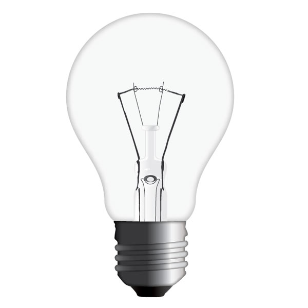
Below is the final image we will be working towards.
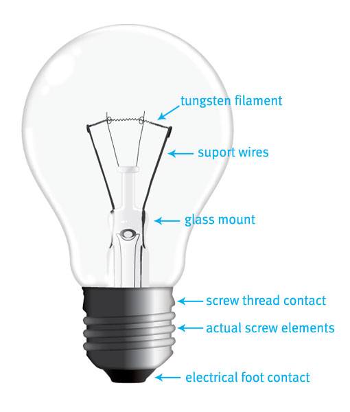
First, there are a lot of different bulbs out there. A client recently requested a traditional one and instead of using reference images, I took a real light bulb and took some time watching how the glass parts bend the light and how highlights and shadows are formed. So, get a reference image or better yet, grab a real bulb and let's start drawing. First, you have to get a grip of the elements that make the bulb, because we're going to recreate all of them.
Let's begin by drawing the glass body first. Create a new document of your choice. I renamed my Layer 1 to "Glass Body." I suggest you name it the same, so it will be easy to follow the rest of the steps and this will help you with the final alignment of all the layers later.
Drag a vertical guide onto the artboard. Create a perfect circle (while holding Shift), and center it to the guide. Select both the right and bottom anchor point and delete them, thus leaving only the top-left part of the circle present.
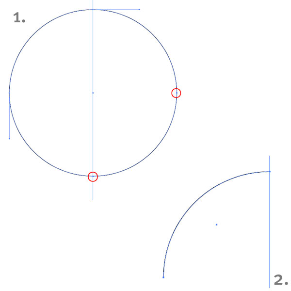
Grab your Pen Tool and using Bezier curves, draw the rest of the left side of the glass body. Duplicate the completed shape and merge them together. We have made the glass body. Let's move on to the screw thread contact.
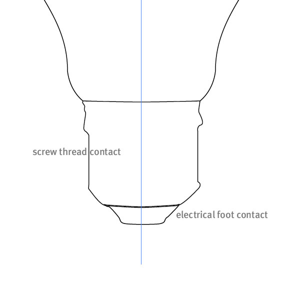
A light bulb is not perfect. This is good for us, because the left and right side of the thread contact don't have to match at all. Ready the Pen Tool and start drawing. When we have completed this part we can move on and do a quick drawing of the electrical foot contact at the very bottom.
Those two shapes are pretty easy and somewhat creative shapes, so you shouldn't have any problems. See how my shapes are overlapping, that doesn't matter at this point.
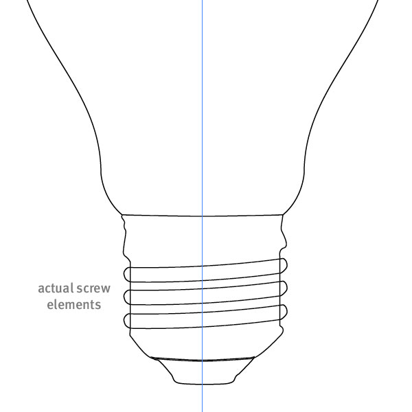
Again with the Pen Tool and Bezier curves, draw a shape that represents the actual screw part. When finished, copy and paste it two more times as shown below.
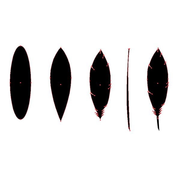
This is the basic outline of outer bulb shapes, but we are missing something, right. Yep, the glass mount, the support wires and the tungsten filament. I found those to be the real challenge of the bulb, so let's leave them for last.
Let's move some elements to new layers. Create a new layer and call it "Metallic Body." Move it above our "Glass Body" layer. Select the thread contact, the three screw elements and the foot contact and move them to the "Metallic Body" layer.
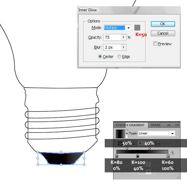
Let's start painting the elements from bottom to top. Fill the electrical foot contact shape with a radial gradient. Set the colors, locations and gradient sliders as shown in the image below. Apply Inner glow as well and remove the stroke.
Let's move on to the thread contact. Repeat the above actions, by applying a Radial Gradient and Inner Glow with the settings shown. Also, remove the stroke.
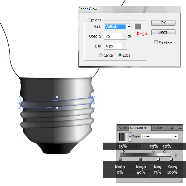
Moving on to the actual screw elements. Apply the settings shown below on all three of them. Remove the stroke. We are basically applying the same radial gradient we did with the thread contact, but we are changing the sliders' positions slightly.
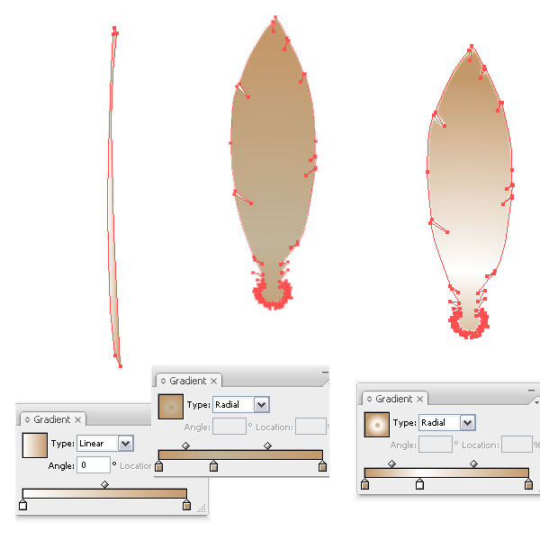
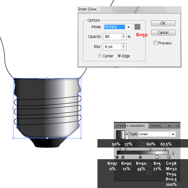
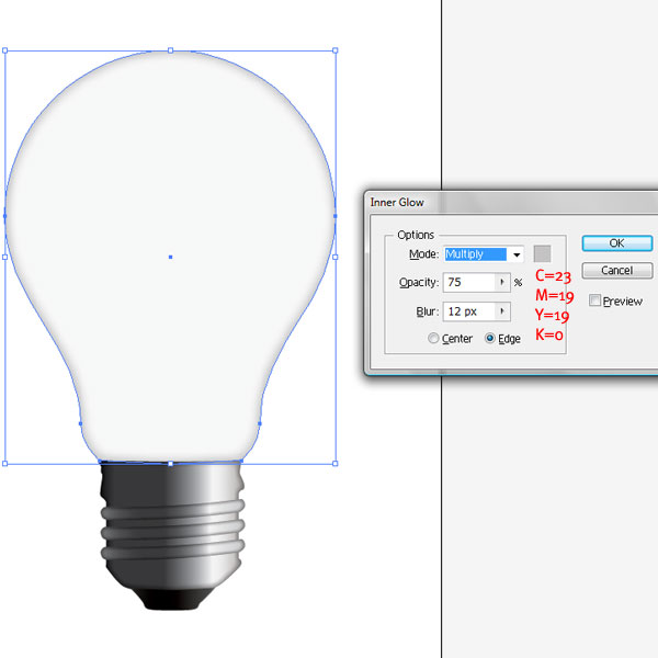
Moving to the glass body. You can lock the "Metallic Body" layer and continue working on the glass one. Remove the stroke and give it a fill color of K=3. We want very light gray that will separate the bulb from the white background. With the shape still selected, give it an Inner Glow and use the settings and color shown below.
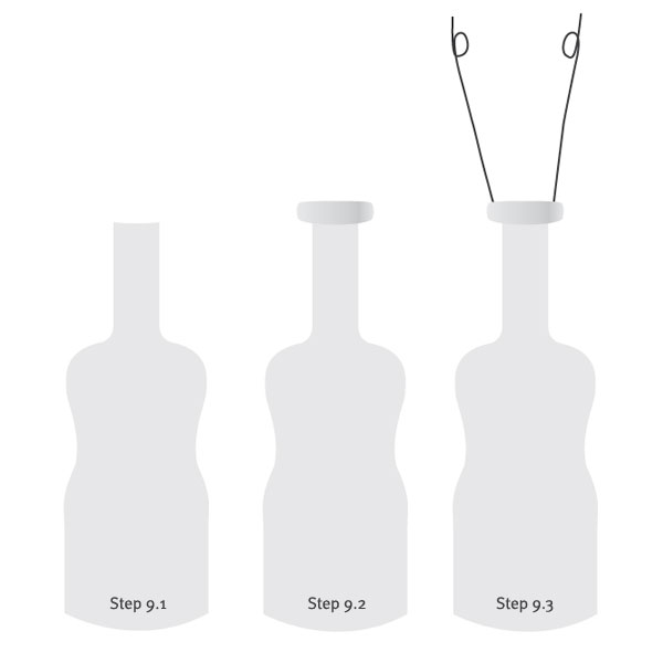
So far, so good. Now comes the hard part - the glass mount. Your task here will be easy or hard, depending on the light bulb you've chosen. I didn't really have a choice, since the client wanted a traditional bulb. Create a new layer and call it "Glass Mount."
I'm going to hide the rest of the layers to better focus on the mount. I created the shape and filled it with K=10 (Step 9.1). On top, I made an additional shape and gave it a radial gradient going from K=10 at 0%, K=20 at 64%, K=25 at 80% and K=10 at 100% (Step 9.2.) I used the Pen Tool and Bezier curves to draw the support wires with 1 pt stroke color of K=90 (Step 9.3).
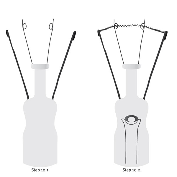
Now, I moved to create four more shapes for the big support wires.
I drew the two wires and noticed that in an actual bulb they are folded at the end. The left one is folded back and the right is folded in front. I drew the folded shapes and sent one at the back and the other in front. Then I filled the wires with K=90, and the folded shapes with K=95. No stroke (Step 10.1).
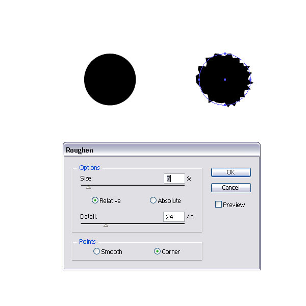
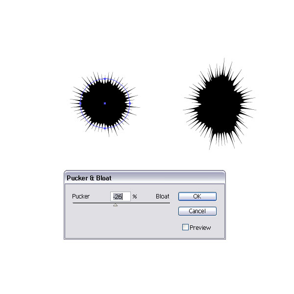
Moving on to the tungsten filament. What I did was pretty simple. I Pen Tooled a line between the big wires and applied Effect > Distort and Transform > Zig Zag. I entered: 1% for the Relative size, Ridges per Segment at 8, Points at Smooth and finally K=90 stroke color. The effect gave nice curved line, just like the real thing.
Additionally, I created the bottom element of the glass mount, along with two ellipses for the central part. I selected both ellipses and in the Pathfinder palette I chose Minus Front to get rid of the front one, this creating a hole in the big ellipse. After that, you guessed it, radial gradient from K=70, K=90, K=80, at respectively 0, 63 and 100% (Step 10.2).
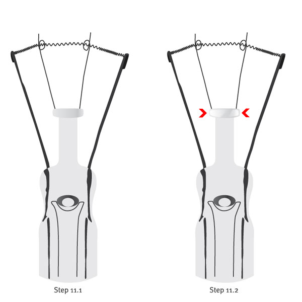
I noticed that the big support wires go inside the glass mount, and the glass acts like a magnifying glass and the wires in there look magnified.
Let's draw that. I made four shapes. Notice that they go all the way down and at places it looks like they are separated, that’s why I made four and not two (Step 11.1).
The glass mount is complete, but look at it - it's flat. We have to make some highlights and play with the opacity and blending modes to create the illusion of 3D. Let's do that!
For the top glass shape I made two highlights. The left one I filled with a white to black gradient, and no stroke. I did the same with the right one, this time with black to white gradient fill. I set both shapes to Screen blending mode. Next I applied a Gaussian Blur of 2 pixels to both shapes and the glass started to appear (Step 11.2).
Let's go on and create more highlights. Simply draw and repeat the same steps until you're satisfied. Experiment with both shapes and with smaller and larger blur radius, but don't forget always to use a white to black gradient set to Screen. This is what gives the actual glass look.
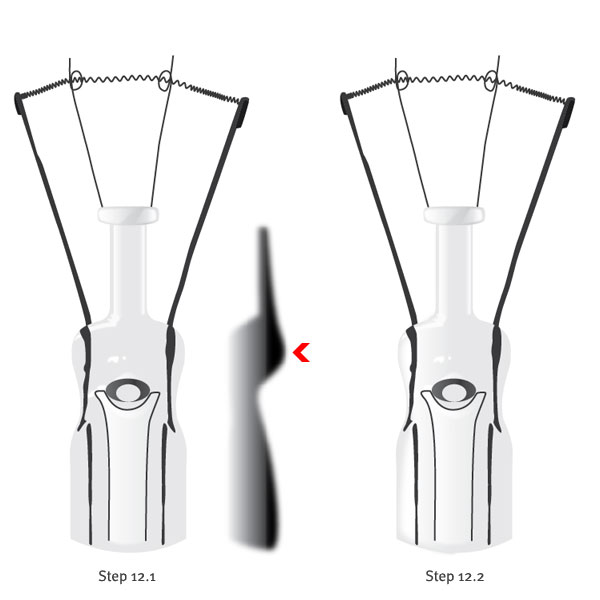
We have to add one final detail to the glass mount - a big reflection going all the way from top to bottom. I made a shape following the curves of the mount, gave it a white to black radial gradient, set it to Screen and gave it big 7-pixel blur. Additionally, I adjusted the gradient sliders to punch it up a bit (Step 12.1).
This is the finished glass mount. Be careful with the object layering. My glass mount is on one Illustrator layer, but the object layering inside the layer is critical. Keep the basic shapes in the back and bring forward the highlights and glows. This will add more to the glass effect (Step 12.2).
Group all the stuff in the "Glass Mount" layer and switch on the other layers. Move the Glass Mount to the center of the bulb using our vertical guide we created in the beginning. Rearrange the layers order as follows (from top to bottom): "Metallic Body," "Glass Mount," and then Glass Body."
The last step in the tutorial is to add highlights to the bulb itself. I put them on a new layer named "Reflections," then moved it on top of all the others.
Next, I created a series of shapes along the right part of the bulb, the bottom and the top left part, where I placed some ellipses. I scaled some of them down and rotated them accordingly. I outlined them in blue for better illustration. At the end I colored all the reflections in white and added Gaussian Blur of 8 pixels to each one.

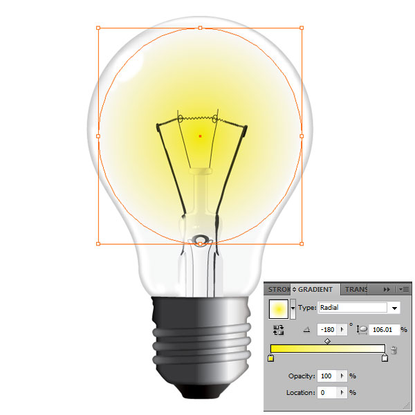
This step is optional. For those of you interested in making the bulb turned on, create a new layer over the "Glass Mount" and below the "Metallic Body" layers.
Create a circle, smaller than the glass body. I gave it a yellow-to-white radial gradient at -180 degrees and set it to Multiply Blending Mode.
The final print came out great. At the end my client was really happy and so was I. I hope you enjoyed creating this realistic vector light bulb!